Portfolio
Web Design
FutureFunds Designs for Web and Mobile
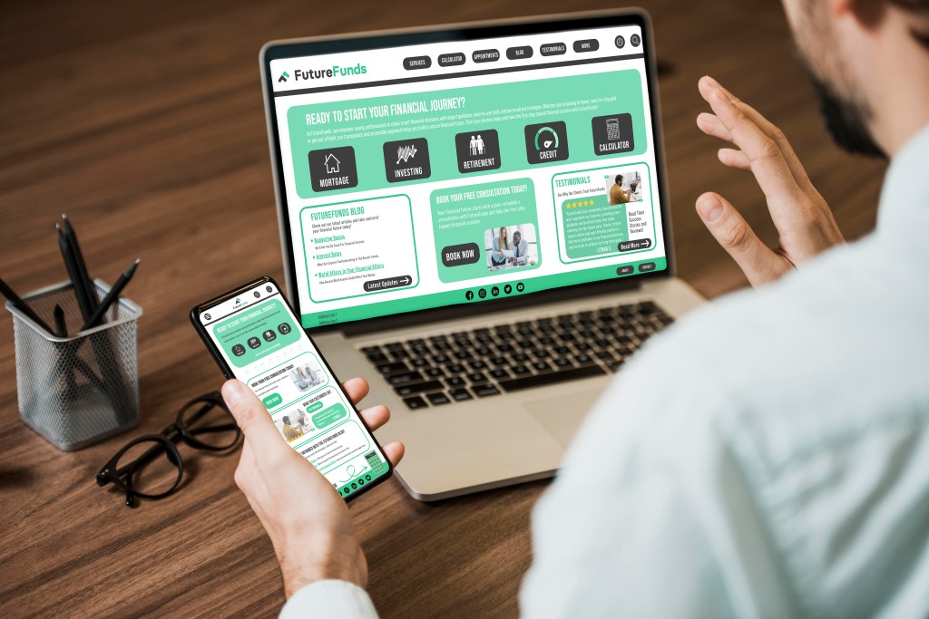
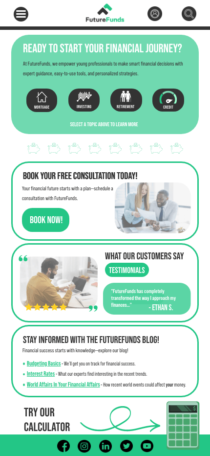
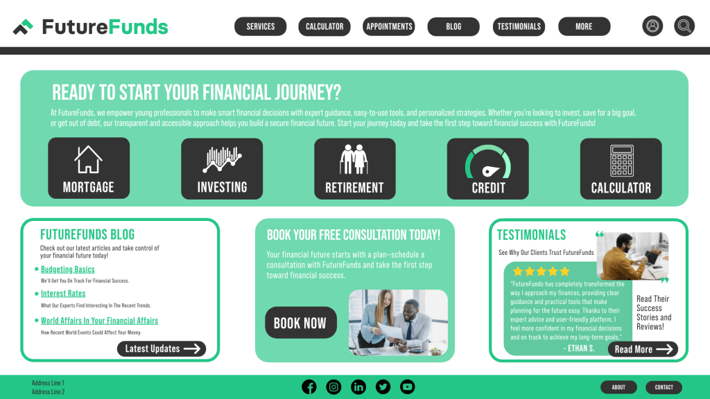
The FutureFunds website mockup is one of my favorite examples of responsive UI design. I created both desktop and mobile versions to demonstrate how a financial service could guide young professionals through major life decisions like budgeting, investing, and credit management. My goal was to make financial literacy feel approachable and modern. I used a clean green-and-black color scheme to represent growth and reliability while maintaining strong visual contrast. I prioritized user experience by using clear hierarchy, CTA buttons like “BOOK NOW,” and icon-based topic navigation. I also included testimonials, blog links, and a calculator callout to offer multiple touchpoints for engagement. I was intentional about creating a layout that would encourage action while still feeling trustworthy and welcoming. The consistent layout and use of space make the content easy to scan and digest. I believe this project clearly reflects my strengths in responsive design, branding consistency, and clear communication. It shows how I can take a concept and build a digital experience that’s functional, informative, and visually polished.
PurrfectlyPeppy Website Design
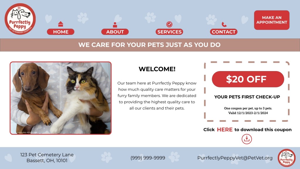
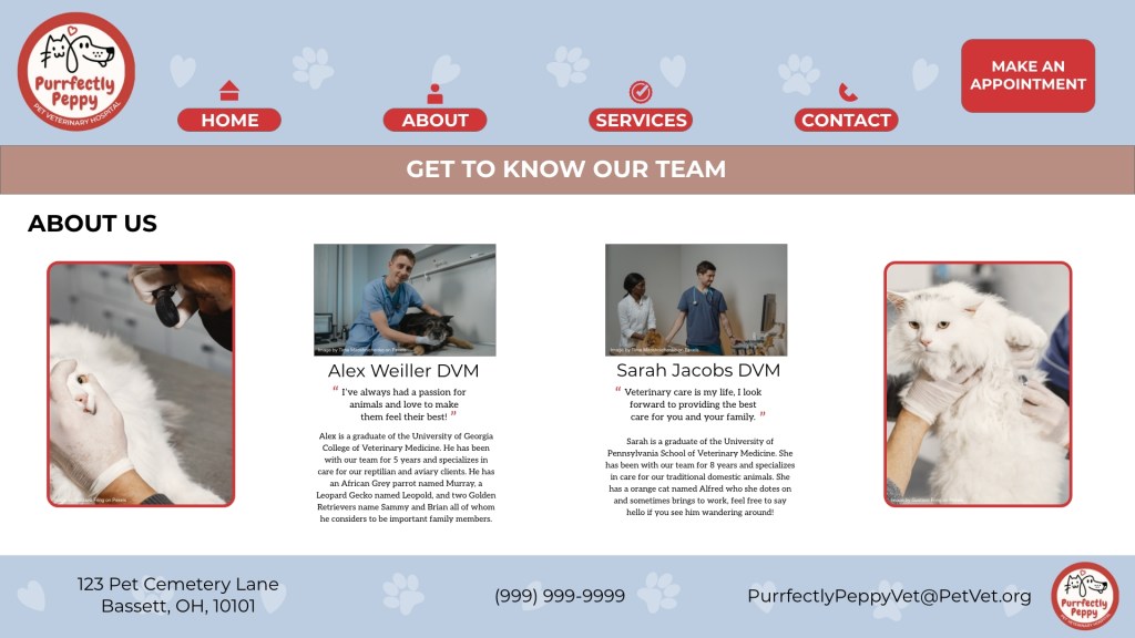
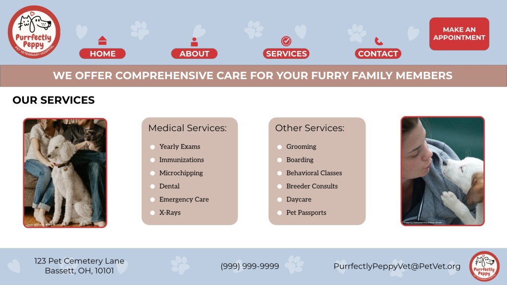
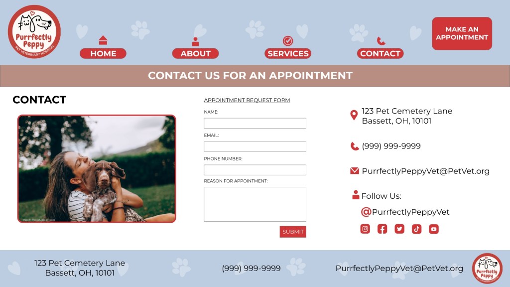
The “Purrfectly Peppy” website was a project where I focused on creating a friendly, engaging, and accessible online presence for a fictional veterinary hospital. I designed four pages Home, About, Services, and Contact with the goal of building trust and making it easy for users to find essential information. I paid close attention to the layout and navigation so that users could seamlessly explore services, meet the staff, and book an appointment. I chose a soft pastel palette paired with bright accent colors to reflect warmth and care. I used friendly, rounded buttons and pet-themed icons to add personality and charm. What I’m especially proud of is the consistency across pages and how each one reinforces the brand’s tone. I also included practical elements like an appointment form and social media links to increase functionality. This project demonstrates my strengths in branding, layout design, and user experience. It reflects my ability to craft a cohesive digital presence that combines clarity, care, and visual appeal.
Print Design
Museum Marketing
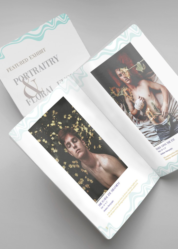
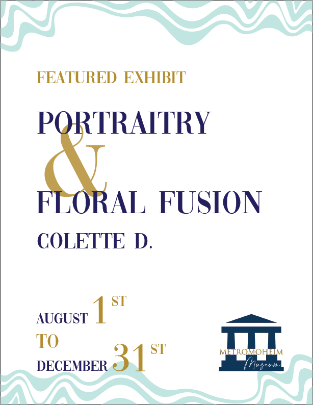
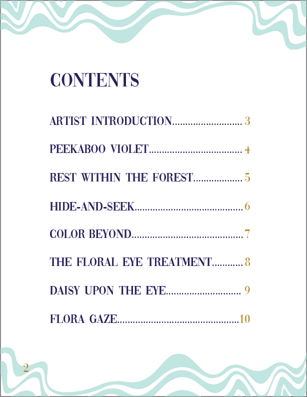

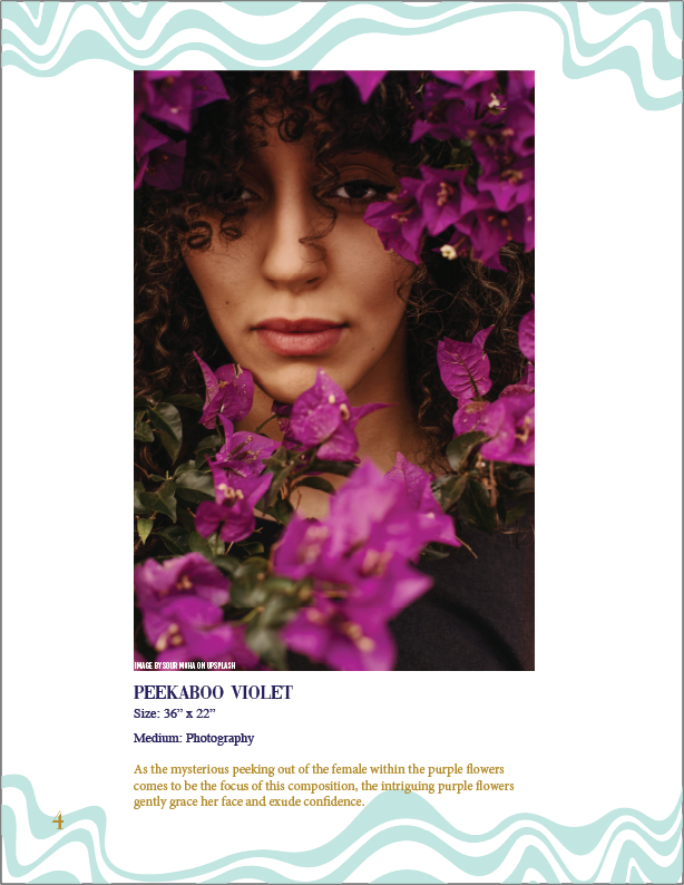
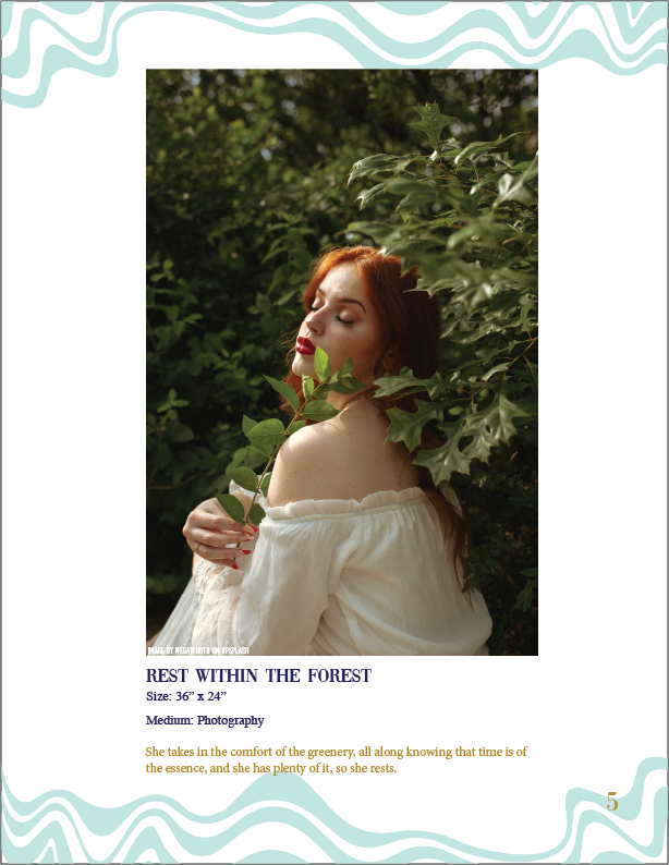
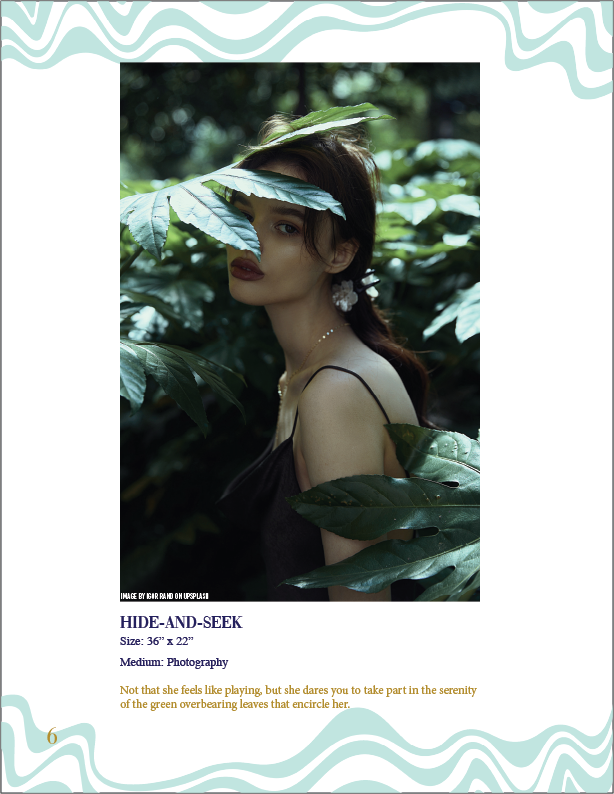
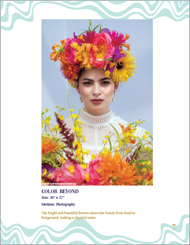


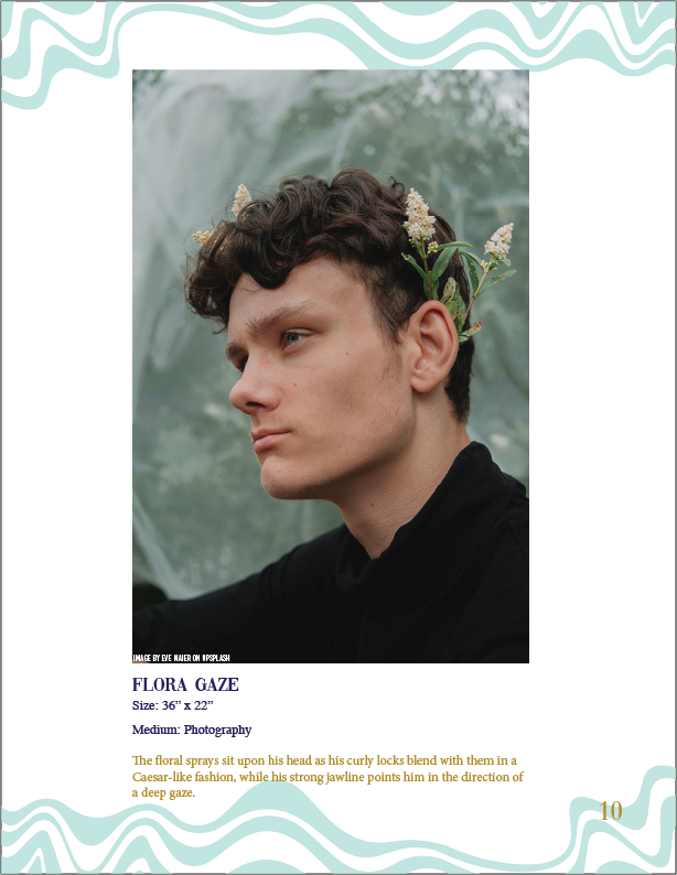
For this piece, I created a gallery catalog for a fictional exhibit called Floral Fusion: Portraitry by an imagined photographer, Colette D. This project gave me the opportunity to blend visual storytelling with editorial design. I wanted the catalog to feel elegant and artistic, with a soft, contemplative tone that reflected the floral and portrait themes. Each page features one photograph along with a short poetic description, designed to draw the viewer into the emotional mood of the piece. I used a clean and consistent layout, letting the artwork take center stage while guiding the reader through the exhibit. The typography is minimal to support the visual rhythm, and the contents page provides easy navigation. I also wrote the artist bio and exhibition intro to add context and strengthen the narrative. I’m proud of the tone and clarity I achieved with this artifact. It showcases my ability to combine storytelling, layout, and image curation in a way that’s immersive and professionally executed.
This card design was created to promote a museum exhibition focused on inclusion and diversity in contemporary art. I used a clean, structured layout to balance event information with curated artwork, while maintaining a sense of celebration appropriate for a New Year theme. The typographic hierarchy clearly guides the viewer from the event title to the featured artists and location, ensuring accessibility and flow.
Fresh Farming Advertising
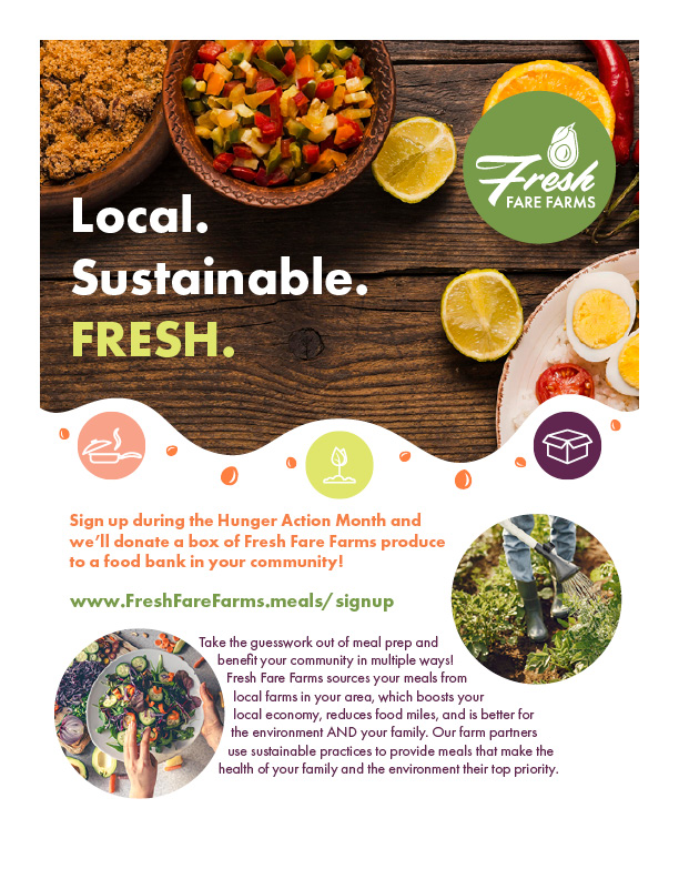
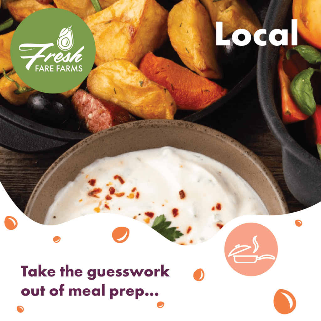
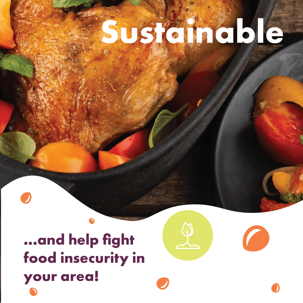
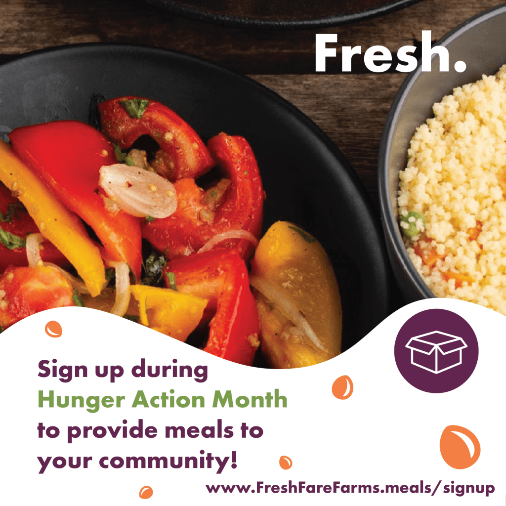
The Fresh Fare Farms poster was designed to promote a sustainable, local meal subscription service. My goal with this artifact was to create a visually clean and persuasive promotional piece that would appeal to families and environmentally conscious consumers. I wanted to emphasize the key benefits health, sustainability, and community impact while directing the viewer toward a clear call to action. I used typographic hierarchy to lead the eye from the bold “Local. Sustainable. FRESH.” headline to the supporting details and sign-up link. The overall layout is minimal and intentional, with strong alignment and spacing to enhance readability. The messaging is warm and community-focused, aligning with the brand’s mission. I feel that this poster successfully communicates the brand values and encourages viewer engagement. Overall, I believe this piece effectively shows my ability to balance messaging, hierarchy, and clean design, and it reflects the projects focus on visual storytelling that inspires action.
Additionally I was tasked with creating a carousel for instagram in which I effectively implemented the same brand style guidelines from the magazine layout to the three social media advertisements.
Branding
Upper Crust Bakery Brand Package
The Upper Crust Bakery branding package was designed to help the bakery transition to a new location with a refreshed identity. The purpose of this project was to create a logo and stationery suite that reflected the bakery’s French roots and artisanal values. I wanted the design to feel elegant and timeless, evoking the charm of a Parisian bakery. The audience includes a wide age range of customers looking for fresh, locally sourced baked goods. The design had to show authenticity, warmth, and sophistication. I chose a rich color palette (deep green, gold, soft cream) and an Art Deco-style typeface, LTC Broadway, to convey tradition and style. I used circular framing and balanced iconography to bring harmony to the logo. I think this artifact effectively meets the audience’s expectations for quality and charm while keeping the brand visually memorable. One of its unique strengths is the thoughtful symbolism bread, chef’s hat, and wheat arranged to imply heritage and expertise. I’m especially proud of the consistency across business card, letterhead, and envelope.
Tour Brochure
The design choices for this project were made to evoke a sense of adventure, relaxation, and natural wonder—all core values of Piddle Paddle Tours. A soft, ocean-inspired color palette and clean typography guide the viewer through engaging visuals, allowing the vibrant tour photography to take center stage. The layout emphasizes clarity and accessibility, ensuring that key offerings like whale watching and stingray snorkeling are easy to find and enticing to explore. These decisions work together to create an immersive, trustworthy, and memorable experience that reflects the spirit of coastal exploration.
Music Streaming Brand Style Guide
This brand style guide was created for a fictional music streaming service targeting Gen Z and millennials. The purpose of this artifact was to establish a clear, consistent visual and verbal identity for the brand. I intended it to be used by designers, marketers, and anyone creating content under the brand’s name. The audience is young, tech-savvy, and expressive, so the brand voice had to be adventurous, informal, and authentic. I focused on simplicity, vibrant colors, and sans serif typography to align with modern digital aesthetics. For the design to be effective, it needed to clearly present usage rules for the logo, type, and color while reflecting the brand’s personality. I used clean layout structures and straightforward language, making it easy to understand and apply. I think this guide represents some of my best work in brand cohesion. A unique aspect is how I tied the competitor research and audience traits directly into visual choices.
Community Cup
The Community Cup Café grand opening poster was designed to promote the café’s launch event and encourage the local community to attend. My goal was to create an eye-catching, friendly promotional piece that would reflect the brand’s warm, welcoming vibe. The target audience includes coffee lovers, local residents, and community-minded individuals who value small businesses and social spaces. The poster needed to clearly communicate key event details like the date, time, location, and promotional offer, while also reflecting the café’s personality. I chose a warm and neutral cappuccino background combined with rich brown accents to evoke warmth and energy. The layout is clean and well-balanced, with a bold header and an easy-to-follow flow of information. What makes this artifact especially effective is that I created all of the coffee illustrations in Adobe Illustrator. I used my vector design skills to create all the graphic elements shown that the café can repurpose these adaptable Adobe Illustrator created designs across future materials such as flyers, menus, or merchandise. This gives the brand flexibility and visual consistency. I’m proud of how this piece showcases my ability to combine promotional strategy with long-term brand asset creation.
Tech Crowd Infographic
This infographic was designed to present social media usage trends across age, gender, and education levels over time. The purpose of this artifact was to take complex data and turn it into something accessible and visually engaging. The audience includes educators, researchers, marketers, and students who want a quick understanding of digital engagement trends. To be effective, the design had to show clarity, logical flow, and visual appeal without overwhelming the viewer. I used line graphs and bar charts in a neutral color palette, with clearly labeled axes and supportive annotations. I made sure to highlight key takeaways in plain language next to each chart to ensure that the viewer could grasp insights quickly. This project helped me demonstrate my ability to interpret and communicate data visually. One unique aspect is the thoughtful layout structure that gives each demographic its own space while keeping the entire piece cohesive. I believe this is one of my stronger pieces in terms of clarity and professionalism.
Tech Crowd Infographic
